Showing posts with label distress. Show all posts
Saturday, April 22, 2017
Shadowbox Collage
I've had so many ideas in my head for what I could do with the Picture Perfect kit from Bird's SVGs.
The kit includes several different sizes and shapes of shadowbox frames as well as a seashore version which can be lit from behind to make a beautiful home decor piece. Here are a few photos from the kit - beautiful, right?
What I love about this kit is the versatility. If you spend anytime on Pinterest or other crafty websites, you're sure to see tons of ideas for amazing shadowbox projects. Shadowboxes are used to highlight everything from rolled flower projects to mixed media collage art as well as gallery walls and special family memories.
The ability to customize the frame to the size you need and to be able to make it exactly when you need it makes this kit a super star in my book.
Last year I made this milk can project, and mentioned at the time that I might make a photo album to
go inside of it.
I never did get around to the photo album, but decided to a do a little collage to highlight one of the photos instead. Using the Square Shadowbox Flower Frame, I cut out pieces in black and metallic cardstock.
For the frame layer, I distressed the metallic cardstock like I did in the milk can project by sanding and scratching it, and then inking the worn spots with Distress ink in Walnut Stain. For the inside backing piece, I embossed it with a mesh embossing folder, sanded it down a little bit and added some Walnut Stain on there too.
After that I had some fun picking out embellishments to add to the front of the frame. I'm really a beginner in the world of mixed media and collage art and this part is always a challenge. I'm never sure if I should add more or quit while I'm ahead. Because of this, I did not add the acetate layer to close up the box. I might just need to add some other items inside that I haven't thought of yet!
The sides didn't really need it, but I had this cool wide tissue tape from Tim Holtz that went with the color scheme and overall feel of the project, so I went around the edges with it. I really love how it came out.
The shadowbox itself is so easy to put together, you could make an entire gallery wall for yourself in an afternoon. I see so many possibilities and uses for these frames in addition to creating them with the flowers and embellishments included in the bundle. I have a feeling I'm going to be cranking these out on my Cricut for years to come!
I'd love to hear what you think in the comments below. Thanks so much for stopping by!
Saturday, December 31, 2016
12 Tags of 2016: December Edition
As usual, I've cut it right down to the wire getting my tag done for this month, but I did spend a lot of time thinking about it. The ideas all fell into place a few days ago. As Christmas has now passed, I used the upcoming new year as my inspiration.
I wanted to use brushed pewter stain, but wasn't sure how that would show up on the burlap, so I opted for a piece of the textile surfaces linen instead and used the Nordic stencil. I really like the subtle shimmer of the pewter stain on the linen. I distress the edges a bit and inked with stormy sky and chipped sapphire ink around the edges.
I continued to use silver throughout the tag, including silver embossing powder on the 'go see do' shadowpress, used some silver metallic ribbon trimmings behind the shadowpress panels and obviously the snowflakes and gears are all cut out in silver as well. I actually added some metallic mixative alcohol ink to the arrow to make it more silvery.
The arrow on the calender tile piece is symbolic of the start of a new year, as well as the ball dropping in Time's Square on New Years Eve. I used alcohol ink to tint a gumdrop a lovely aqua color (a favorite color of mine) and added it to a few layered mini snowflakes to represent the infamous ball. I added some mercury glass Stickles to add a little bling reminiscent of the sparkling ball as well.
The snowflakes (mini paper snowflakes thinlit) and gears (gearhead thinlit) represent the transition from the holiday season into the new year and time to get back to work and busy with new endeavors.
The snowflake with the hope token and mirrored star is a tribute to Carrie Fisher. I've been a huge fan of Star Wars since I was a child and have lived long enough to have seen every single film in the theater. It was a sad and sentimental day when I saw Rogue One the day after her passing. Anyone who has seen the film will understand why I chose the message of hope to represent her.
The clock and 17 number brad represent the passage of time into the new year, 2017. The 17 was filled in using picket fence distress crayon. I mounted it on a square of green Nordic print from the Tidings paper collection and edged it with some stormy sky and chipped sapphire ink before deciding to add some rock candy glitter too. Love the icy sparkle this adds.
Last, I used some brushed pewter stain over the 'auld lang syne' chit chat sticker and attached it with the mini attacher to a remnant piece of navy cardstock.
Thanks so much for stopping by to check out my tag and last blog post of the year. I can't wait to see what 2017 brings! Go. See. Do.
Wishing you all a very happy new year!
Sunday, October 30, 2016
12 Tags of 2016: October Edition
Well, I can't believe it's been over a month since my last post! I had some deadlines to meet and hopefully can get back to some normal posting again.
I'm glad I was able to spend some time getting my tag done today, because I was thinking about all week. I didn't have any of the monster dies like Tim used - see Tim's original post here - so I jumped straight to Christmas and was able to use all of the same techniques.
I used some paper from Tim's Tidings holiday stack and cut it up into little bits of ephemera for collaging with.
I covered my finished patchwork with crazing collage medium, let it dry and added some hickory smoke crayon around all of the edges.
This picture shows a close up of the wonderful cracks that the crazing medium creates when dry. It reminds me of old porcelain. This picture also shows the little pincone adornment I added to the ribbon. Before I added it, I dabbed it lightly with some glossy accents and dipped it in vintage platinum distress glitter dust. It's hard to see in the photo, but really adds some lovely sparkle.
I also used my spatter brush to add some white paint/snow to the surface once all of the crayon had been added and worked into the crazing.
I think the tattered poinsettia die with coordinating texture fade came out so cool when cut from adhesive foil stuck to cardstock. I used the same technique Tim did for painting and then wiping away, but more color stayed in the debossed area as it's hard to wipe it away from all the nooks and crannies. I love how the colors came out.
Once the paint dried, I did add a little crayon on the poinsettia as well, just to add some shading. I also added some distress glitter in mustard seed as the poinsettia center.
Monday, August 15, 2016
12 Tags of 2016: August Edition
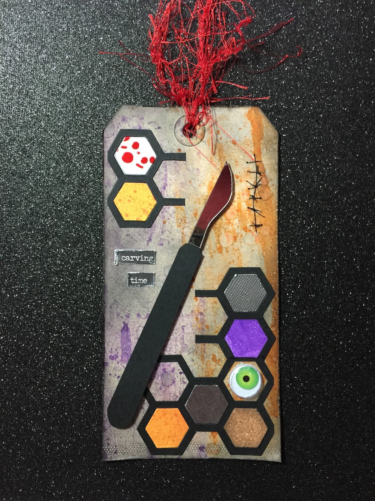
Honestly, I'm not sure what got into me with this tag. I'm not into bloody and gory Halloween stuff. Horror movies are NOT on my must-see list of films! For some reason though, my tag for August took a creepy turn. Tim's original tag can be found here.
Maybe it was the recent delivery at my doorstep of almost the entire idea-ology Halloween collection that had me thinking of the spooky season in the middle of August! Whatever it was, I sure had fun putting this tag together.
I used wilted violet and carved pumpkin for the brayered stain with some hickory smoke and black soot around the edges, and obviously the honeycomb framework for the shape.
During Creative Chemistry 103 I was experimenting with tinting the transparent gloss texture paste and created some blood spatter by adding some fired brick stain and then applying it through the Splatters layering stencil.
I had my experimental piece sitting on my desk and decided to whack it up and use it on the tag. Just like Tim said in class, you can always find a use for unloved results as background, die cuts, etc. Not that I didn't like the spatter result, it was just a really small experimental piece, so made a perfect tile in the framework.
The orangish tiles are leftover pieces of a long ago experiment with Perfect Pearls sprays, so they have a bit of a sheen to them. Wilted violet was used to ink up a plain white tile and I also cut up some remnant silver and cork pieces to add to the mix. The big green googly eye is what started me down this creepy path.
I cut the scalpel out on my Cricut and added some Mirrored for the blade (cut by hand). I added some sutures on the right and the carving time chit chat stickers. I meant to use some more staples here and there with the mini attacher, but ran out and couldn't find my refill box.
Last but not least I added some red fringy fibers as my ribbon as it kind of reminded me of blood spray. I know....so creepy!
Anyway, I certainly tried something new with this particular tag and had a blast doing it. Thanks for stopping in to check it out.
Sunday, July 31, 2016
Got Milk?
When I first saw the Bird's SVGs 'coming soon' message regarding the Nature's Bounty kit, I was truly excited to see a milk can in the collection. Over the past year or so, I've been trying to combine my love of both paper crafting and genealogy into some of my projects.
My great-grandparents lived on a farm in Pennsylvania, and my great-grandfather Harry was a dairy manager. Unfortunately, my great-grandmother passed away at a very young age when my grandmother was barely four years old. One of the few pictures I have of my great-grandmother is this one with my grandmother as an infant, and a few milk cans in the background.
Add in Harry's career as a dairy man (pictured on the right in the photo below) and you can see why I thought this project would be so much fun to incorporate into my family history projects/home decor. Because this milk churn is also a box, I'm thinking it might be fun to put together a mini album with some of these photos which I can store inside the can. That'll be a project for another day though.
Okay, family history lesson over! I did an online search to get a feel for what vintage milk cans looked like and notice that many of them had raised/embossed lettering on the sides with the name of the dairy they came from. I love that Harry's name rhymes with 'dairy,' so I decided to make that the name for the side of the can...Harry's Dairy! The next trick was figuring out how to get the look of raised metal letters.
I decided that I could cut the letters out of the same metallic paper I was using for the can and then just glue them on. I used Tim Holtz Alphanumeric Thinlets to cut the letters.
There are also a lot of photos of very rusted and distressed old milk cans, so before I added the letters, I scratched up and sanded the metallic cardstock panel pieces and then inked them all with some Distress ink in Walnut Stain.
Thanks to Bird's wonderful design, I was able to put it all together in just an hour or two which included everything from the time I fired up my Cricut until I was taking pictures of the finished project.
There are a few days left for you to get the Nature's Bounty kit from Bird's SVGs while it is still on special - a great deal with so many fun projects.
You can find it here: Nature's Bounty SVG Collection
And here's one more look at my finished project:
Thanks for stopping by! I'd love to hear what you think of my vintage milk can in a comment below.
Sunday, July 3, 2016
Oh say can you SEA...
I just fell in love with the Waving Flag Bag in the new Happy 4th SVG kit from SVG Cuts! I considered making it in the traditional red, white and blue colors, but for me the 4th of July was often celebrated on the New England seaside and I've always had a love of the beach and could just picture this flag with a bit of an ocean theme.
When flipping through my paper stash, I came across an older K&Company stack by Tim Coffey called Travel which is loaded with wonderful designs, so I picked a few to represent the red, white and blue and went from there. I inked the panels using Distress inks in Antique Linen, Iced Spruce and Fired Brick.
I also dug into my Tim Holtz die inventory to create the starfish 'stars' for my beachy flag. These are from the Sand & Sea dies, Bigz and Movers & Shapers. I tried to keep the color light so it would show up against the relatively light blue background. I rubbed the stars with a little Distress Stickles in Scattered Straw. It looks a lot like sand in person.
As usual I spent more time on paper selection than actually building the project. This is a super easy project to do and makes such a nice seasonal decor piece.
Happy 4th of July!
Labels:
4th of July,
distress,
fish,
flag,
K&Company,
ocean,
sand and sea,
sea,
starfish,
svg,
svgcuts,
tim holtz
Tuesday, May 31, 2016
12 TAGS OF 2016: May edition
Wow, I really waited until the last minute to finish this one up. May has been a busy month!
Tim's original tag can be found here, and this is my take on this month's technique remix.
I saw a photo on Instagram the other day of some beautiful pink roses with the most lovely blue sky behind them and I was smitten! That is where my color inspiration came from.
There was a small when I went to grab my texture paste and found it all dried up. OH NO! I think I must have put the cap on crooked the last time I used it. Boo!
I was thinking about what I could use in place of texture paste and remembered thinking how clever Paula Cheney was in a recent blog post. She applied collage medium through a stencil for just the right amount and to very cool effect. I figured why the heck not, and did the same with some matte collage medium. It turned out to be another layer of resist on the tag, but I was happy to have a solution of sorts and wanted to try Paula's technique anyway! You can see where I added some numbers on the right side and the bubbles on the left and bottom.
Last but not least, I sure did have fun with the tiny tattered floral die this month. I ordered it for myself early in May since for some reason I didn't already have it. I proceeded to use it on two other projects before I even got around to putting them on this month's tag.
I had some tag backgrounds that I made previously and didn't love, so I used them to cut out some of the flowers. I think they add a neat, colorful effect. I did the same thing with the leaves.
You can see some of the other tiny tattered florals on my fairy cottage post. And here's a picture of how I used them in yet another other project:
I think the tiny roses cut out in green look just like succulents when added to a miniature terracotta flower pot. I can tell I'll be putting this die set to very good use.
Thanks so much for stopping by!
Tim's original tag can be found here, and this is my take on this month's technique remix.
I saw a photo on Instagram the other day of some beautiful pink roses with the most lovely blue sky behind them and I was smitten! That is where my color inspiration came from.
There was a small when I went to grab my texture paste and found it all dried up. OH NO! I think I must have put the cap on crooked the last time I used it. Boo!
I was thinking about what I could use in place of texture paste and remembered thinking how clever Paula Cheney was in a recent blog post. She applied collage medium through a stencil for just the right amount and to very cool effect. I figured why the heck not, and did the same with some matte collage medium. It turned out to be another layer of resist on the tag, but I was happy to have a solution of sorts and wanted to try Paula's technique anyway! You can see where I added some numbers on the right side and the bubbles on the left and bottom.
Last but not least, I sure did have fun with the tiny tattered floral die this month. I ordered it for myself early in May since for some reason I didn't already have it. I proceeded to use it on two other projects before I even got around to putting them on this month's tag.
I had some tag backgrounds that I made previously and didn't love, so I used them to cut out some of the flowers. I think they add a neat, colorful effect. I did the same thing with the leaves.
You can see some of the other tiny tattered florals on my fairy cottage post. And here's a picture of how I used them in yet another other project:
I think the tiny roses cut out in green look just like succulents when added to a miniature terracotta flower pot. I can tell I'll be putting this die set to very good use.
Thanks so much for stopping by!
Thursday, April 14, 2016
12 TAGS OF 2016: April Edition
This was an April 2016 winner on timholtz.com!!
Tim's original tag can be found here, and this is my take on this month's technique remix.
For the resist portion of the technique, I used a 'splotchy' background stamp that reminds me of bubbles which I stamped using white Distress paint and then added layers of color with both Distress stains and Distress ink. I also gave the tag a light mist of opalescent sheen with some Dylusions mica spray although I'm not sure you can see that in the pictures.
For the mosaic portion of the technique, I was excited to crack open the new Distress paper mosaic kit and give it a try. It was fun to play with and there's so much in the kit, that I can make a lot of projects with the supplies.
The seahorse is done is the typical mosaic fashion to look like a tiled piece, but I had fun playing with the grout texture on the sand dollar and starfish too.
I created the paper I used for the seahorse using the new Distress collage medium, crazing version. When dry I colored and smudged over that with some Distress crayons to add some color in the crazing. I love the porcelin look this gives. If you click the picture below, you might be able to see the detail close up.
For the starfish, I added the grout to the shape and let it dry. I painted it with a combination of Distress paints in barn door and wild honey and while the paint was still wet, sprinkled it lightly with some spiced marmalade Distress glitter. I really dug into the Distress stash for this project!
The sand dollar was sort of a combination between grout and 'tile' work. I gave the grout a coat of antique linen Distress paint as the white seemed too stark.
Last but not least, I added some vegetation from the festive greenery Sizzix Alternations die, added a little smear of crayon to the chit chat stickers and stuck an opal gem to an Ideaology charmed thingie which I threaded onto the very organic looking trim I used for a ribbon - it reminds me of sparkly seaweed!
All in all, I'm pretty happy with the results. I always think of things to edit after the fact, but I'm trying to take Tim's advice to embrace imperfection, so I'm going to call this one done!
After using the mosaic kit, the wheels in my head are turning and I look forward to using this technique on some 3D paper projects - the best of both worlds!
I'd love to hear what you think. Thanks for stopping by!
Subscribe to:
Posts (Atom)