Saturday, August 27, 2016

Go Fish!


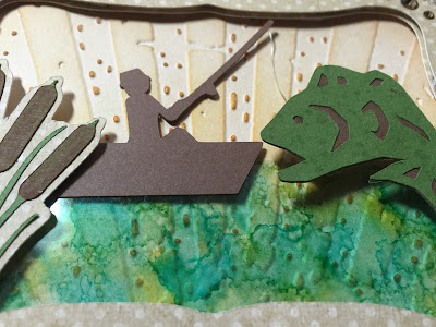
Timing was perfect for me to make a masculine birthday card that fit with the Simon Says Stamp Monday Challenge.

I used the Tim Holtz Rays texture fade to emboss the background which I inked slightly to highlight the embossing. Over that I layered a piece of acetate which I alcohol-inked to look like water.


I added a few cuts from my Cricut for the fisherman, bass and cattails. I used a small piece of fishing line leading to the bass which I put on an Action Wobble. Mr. Bass looks like he's putting up a good fight when you wobble him!


I added just a little bling on the corners so it didn't get too flashy for an outdoorsy guy. Thanks for stopping by!

Friday, August 26, 2016

Not so white Christmas!

I was eagerly anticipating the release of the White Christmas collection from Bird's SVGs as I just fell in love with the preview photos and all of the layering and different types of cardstock used in the projects. 

White Christmas from Bird's SVGs
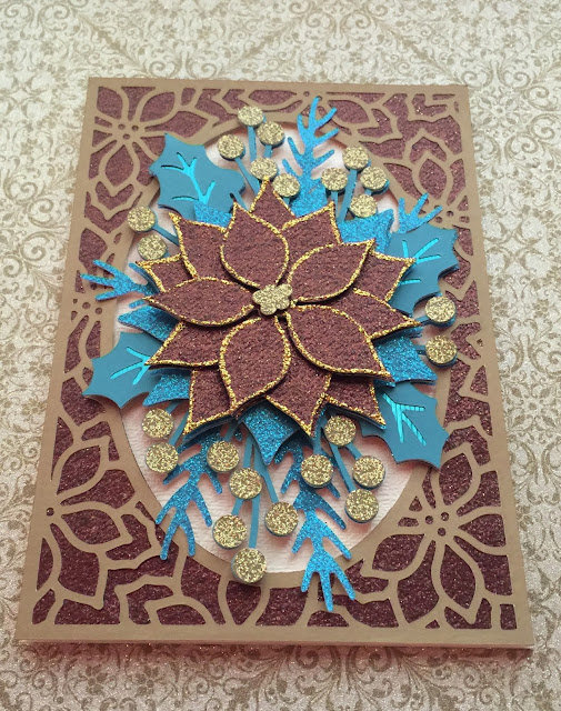
I started sifting through my stash looking for some nice pearl, glitter and mirror cardstock to create my own version of the lovely poinsettia card. I've recently been admiring some beautiful Christmas trees and decorations done in brown, green and teal. As I had some of those colors in my supply, my project went from white Christmas to peacock colors in the blink of an eye!


My love of paper might be matched by my love for glitter and shimmer in crafting. I'm still undecided if I went overboard on the glitter here, but I figure if you can't go all out glitzy for Christmas then you never can!

The base of the card is a cream pearl layered with brown glitter and a brushed gold for the lacy layer around the oval. The teal colors are from glitter, foil (as seen in the leaf veins) and plain cardstock. Here's a picture at a slight angle so you can see the shimmer from the foil on the teal leaves.


The berries and center of the poinsettia are cut from gold glitter and the poinsettia itself is the same brown glitter cardstock used in the background. I edged the brown poinsettia leaves in gold so the layers would stand out as they are dark in color and the shadows from the layering didn't show up as much as I wanted them to. This also ties in the gold berries and center piece.

One of my favorite things about this card is the dimension from layering. This isn't the best photo, but you get the idea. Layers of goodness here! 


In the process of auditioning papers for this project, I made a second poinsettia from a patterned gold glitter paper. It obviously didn't end up this card, but it might just go on another one! Other ways to use this poinsettia might be as an ornament for a Christmas tree, a lovely addition to a bow on top of a gift, or maybe even with a pin glued to the back so it can be worn as a piece of jewelry over the holidays. 


So be sure to check out all of the wonderful holiday projects at Bird's SVGs, many of which are completely free. I made this card from the Let It Snow collection last year. There are lots of lovely designs to choose from.


Happy weekend and thanks for stopping by!

Saturday, August 20, 2016

Pumpkin Prize Ribbon

It seems like once the 4th of July has passed us by (here in the US anyway), all seasonal crafting takes a swift turn towards Halloween, Thanksgiving and Christmas. 


Every year my employer holds a pumpkin carving contest for the employees. I usually volunteer to make the prize ribbons and this year is no different.  What is different, however, is the really cool ribbon design I'm going to be using. 

Check out this ribbon from Bird's SVGs Simply the Best Card Collection that I'll be using as the base for this years' design. I made the ribbon only and not the card that goes along with it. 

Simply The Best SVG Card Collection
The scary pumpkin head is from one of Bird's many FREE collections and is called Halloween Characters. I wanted to make him look like he was lit up, so I cut a plain back panel in yellow cardstock and then mounted the front orange face piece with some foam tape to add some dimension. 

There are many different ways to create the solid back panel like I did here, it really just depends on what software you are using. I use a Cricut and I found it easiest in Cricut Design Space to simply duplicate the design and then use the contour function to hide the facial features on one of the pieces.

I'm still fiddling around with the colors a little bit. I think I might go with a bit of a deeper purple to match the lovely purple Stickles I used around the center.

While in Halloween mode, I also downloaded Bird's FREE Haunted House Card & Bag file. I enlarged the file so the house measures about 8 inches tall and 7.25 inches at it's widest point. I used some yellow vellum for the windows and added some battery-operated lights inside so this haunted house is all ready to glow through the spooky season!


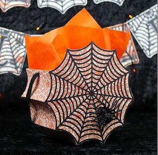
If this post has gotten you in the mood to do a little bit of holiday creating, be sure to check out Bird's SVGs for some really great inspiration. I just love this bag from the Spider Venom Collection!


And if you visit Bird's Facebook page right now, you can enter for your chance to win her brand new White Christmas Collection which is being released very soon. 

Good luck and thanks for stopping by!

Monday, August 15, 2016

12 Tags of 2016: August Edition

Honestly, I'm not sure what got into me with this tag. I'm not into bloody and gory Halloween stuff. Horror movies are NOT on my must-see list of films! For some reason though, my tag for August took a creepy turn.  Tim's original tag can be found here.


Maybe it was the recent delivery at my doorstep of almost the entire idea-ology Halloween collection that had me thinking of the spooky season in the middle of August! Whatever it was, I sure had fun putting this tag together.

I used wilted violet and carved pumpkin for the brayered stain with some hickory smoke and black soot around the edges, and obviously the honeycomb framework for the shape.

During Creative Chemistry 103 I was experimenting with tinting the transparent gloss texture paste and created some blood spatter by adding some fired brick stain and then applying it through the Splatters layering stencil.


I had my experimental piece sitting on my desk and decided to whack it up and use it on the tag. Just like Tim said in class, you can always find a use for unloved results as background, die cuts, etc. Not that I didn't like the spatter result, it was just a really small experimental piece, so made a perfect tile in the framework.  

The orangish tiles are leftover pieces of a long ago experiment with Perfect Pearls sprays, so they have a bit of a sheen to them. Wilted violet was used to ink up a plain white tile and I also cut up some remnant silver and cork pieces to add to the mix. The big green googly eye is what started me down this creepy path.


I cut the scalpel out on my Cricut and added some Mirrored for the blade (cut by hand). I added some sutures on the right and the carving time chit chat stickers. I meant to use some more staples here and there with the mini attacher, but ran out and couldn't find my refill box. 

Last but not least I added some red fringy fibers as my ribbon as it kind of reminded me of blood spray. I know....so creepy! 

Anyway, I certainly tried something new with this particular tag and had a blast doing it. Thanks for stopping in to check it out.

Thursday, August 11, 2016

Football Marquee Sign


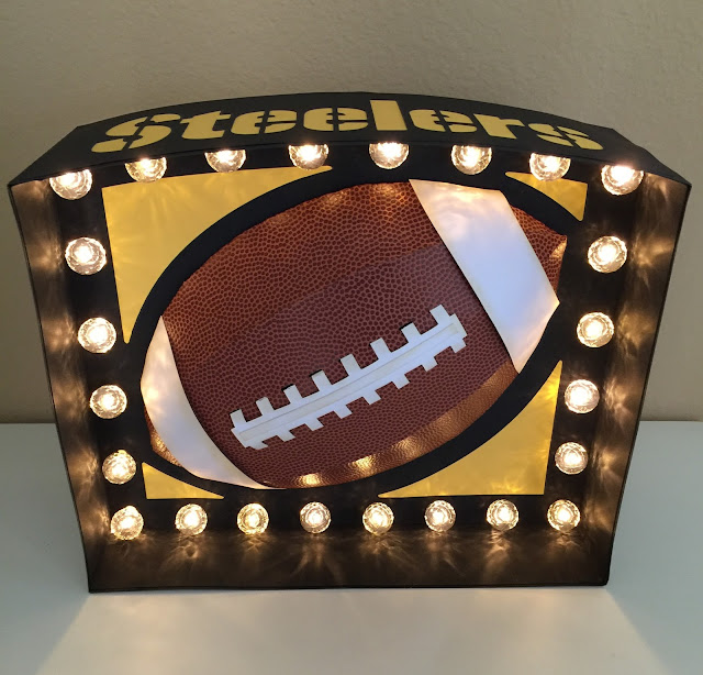
I had so much fun building this football marquee sign from the SVG Cuts Game Day Marquee Signs kit

I used some pigskin paper that I found at Hobby Lobby for the football, and therefore did not use the extra football panels for embossing since this paper is already textured.  


Since this is for personal use only, I added a "Steelers" cutout to the top panel. One thing that I found out after the fact is that NFL footballs don't have the white stripes on the ends. Unfortunately they were already glued down when I was informed of this, so my project might look a little mismatched to die-hard football fans, but I'm good with it and so is the recipient. And now I know for next time! Am I the only one who didn't know this?

I had some of the smoke-colored, faceted Heidi Swapp bulb caps in my stash, so I used those as they blend in really nicely with the black background paper when the lights are off. 


And when the lights are on, they're a little bit of a softer light and I love the effect from the facets.


I have a feeling I'll be making several more of these for Christmas for the sports fans in the family!  I got this one done just in time for tomorrow night's first pre-season game for the Steelers. I hope it brings them luck.            

Thanks for stopping by!