Sunday, May 8, 2016

Fairy Cottage


I'm so excited to have completed the Fairy Cottage from SVGCuts! It took my several days to get started on this because I was having a hard time picking out paper. Honestly, that's the hardest part of some of these projects. I went with a primarily pink and green theme this time, but have about ten alternatives in my head in case I feel the need to build an entire fairy village!

I started out with the Whimsical World Stack by DCWV and picked several papers that seemed to go well together.


I used the Tim Holtz wood grain texture fade for the 'stump' panels. This was my first time adding ink to the embossing folder before running it through the machine and I love how it came out. I think
it really enhances the dimension of the embossing. I used TH Distress Walnut Stain. I will definitely be doing this again.


I just recently completed Tim Holtz's April tag challenge (and won!) using the new Distress Paper Mosaic Kit. This certainly made me think of how I could use this kit on so many different svg projects.  I didn't use the grout here, but I 'tiled' some leaves onto the patio. The leaves were fussy cut from leftover paper from the right side roof.
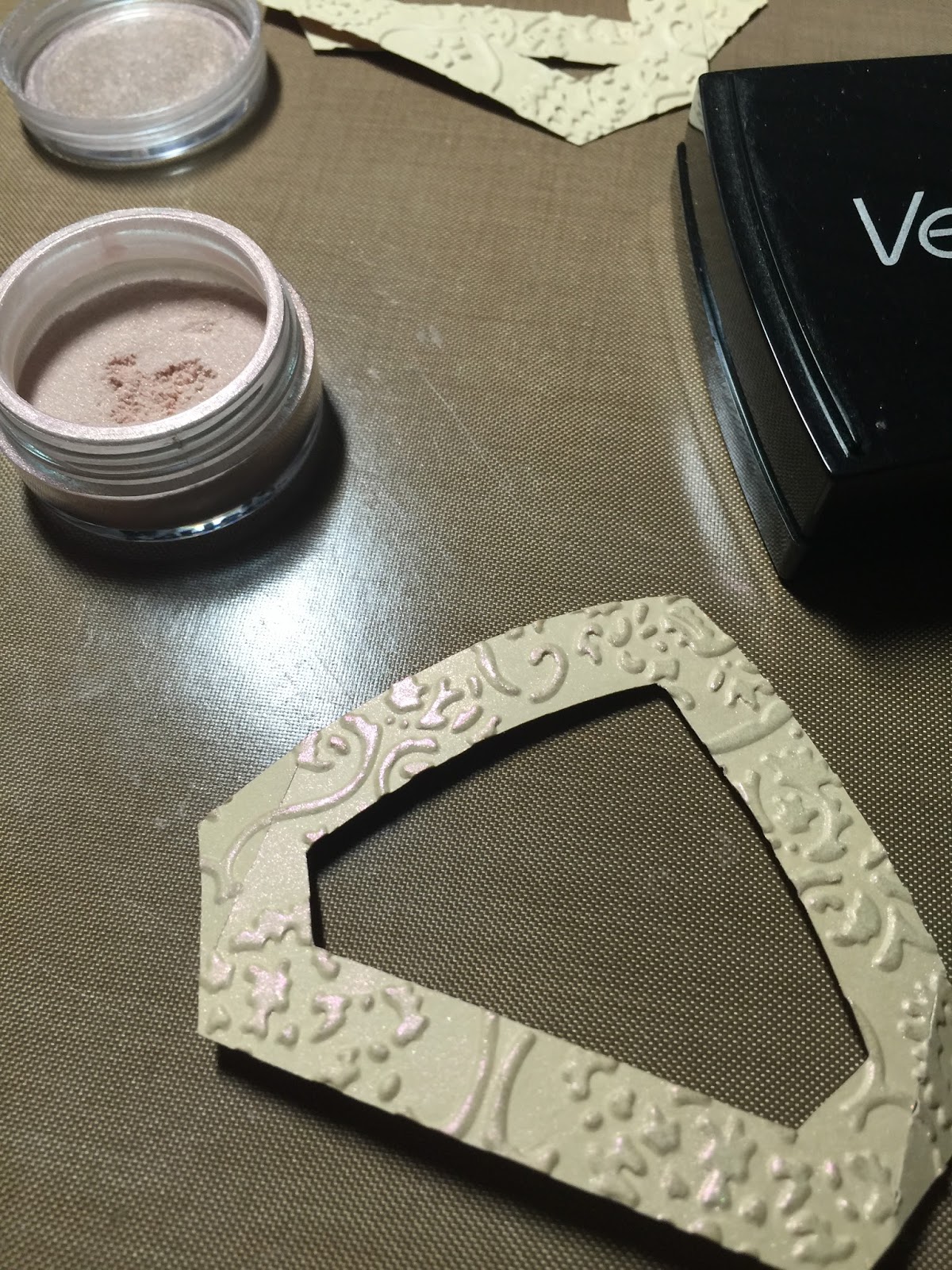

I embossed the window frames and dusted them with Perfect Pearls (in Blush) to add a little bit of magical shimmer. You can see the shimmer below along with a picture of the twig railing I installed with the use of some hot glue and a lot of patience. I'm still finding twig bits here and there around my workspace!


Here's the roof to which I added a fun little butterfly from a Martha Stewart punch. Also, the brown roof trim was not showing up very well against the boldly patterned paper, so I added some blue liquid pearls to it so it would stand out more. 


It's hard to see, but I also added some iridescent Stickles to the cotton smoke coming out of the chimney. I wanted it so seem as though the fairies were brewing up something magical in there!

Added bonus, when turned the lights on in the cottage, I noticed the light is shining up out of the chimney which I think totally adds to the magical effect.  Love this happy accident!


I love what I call the 'bubble' paper so much that I put it on everything from the chimney to the stairs. Kind of like magical cobblestones!  And the leaves from this right roof paper are what I used to tile the patio. 


Last but not least, here is the cottage all lit up. I know the doorknob looks like it's glowing, but there's actually a little pink pearl on there.  More magic from the fairies I suspect!


I embellished with some flowers made from the Tim Holtz Tiny Tattered Floral die and the ladybug wood piece is something I made a year or two ago using a technique I saw on Pinterest.

It's basically stamped with a rubber stamp and then I used a wood-burning tool to trace the stamped image.  It's been sitting on my desk for way too long and seemed like the perfect addition to my fairy cottage. It also coordinates nicely with the papers as there are some ladybugs in a few of the prints.


If you've made it this far, thanks for hanging in there and thanks for stopping by! Wishing you some fairy magic!


Monday, April 25, 2016

Teapot Box Card


Just a quick post to show what I've been doing other than making trophies - I made this adorable teapot box card from SVGCuts new Worlds Best Mom kit.

I'm actually going to be using this as a birthday card which is just perfect for the tea-loving recipient.
This was quite easy to put together and just so cute!

I did add a little pearl to the center of the orange flower after this picture was taken.

Thanks for stopping by!

Trophies completed!

43 pieces of cardstock and a lot of glue later, I have finally finished the trophies I told you about here.

These will have some 'stuff' in them for the winners of a contest we're having at work. To understand why I chose the paper I did, you should probably know that the contest is a paper mache house decorating contest.


I was beyond thrilled when I found this adorable Houses paper by Echo Park that not only tied in the houses and neighborhood theme, but also has the colors most often used to designate first, second and third place. It's like it was meant to be.

I also lucked out when I found a 5-for-$1 cardstock sale happening at the craft store that week and managed to get all my solid sheets (30 pieces) for only $6.  Score!

I had piles of paper pieces everywhere!  Here's 60 handle panels and 90 base panels:


And here are a few of the handles in early stages on my assembly line - I found it easiest to do them in batches so I could work on one while others got some good glue dry time:


I chose to use some Tim Holtz Deco Tape to go around the top and bottom instead of cutting out the provided pieces in the kit. The tape was easy to just wrap around and cut where needed, but I did have to supplement with a few dots of glue here and there as the tape isn't super sticky.


When I started this project, I toyed with the idea of adding a little fenced yard as a base for each trophy, but then it started getting out of hand. I wanted to add flowers to the fence and a mailbox and grass and...well, you get the idea.  I reigned myself in and made the decision to keep it simple.


They are done and delivered at last. Now I just have to decorate a paper mache house to try to win one!


Thanks so much for stopping by. I'd love to hear your thoughts on this project. 

Thursday, April 14, 2016

15 Trophies!


For anybody wondering why I haven't posted any paper projects recently, it's because I made the crazy offer to build 15 trophies using the Dreaming Tree Irish Coffee Mug file, so I've been pretty busy gluing my life away.  

I'm coming down the homestretch and will post more pictures when they're all done, but here's a few work in progress shots.  I saved the handles to last as I had to build 30 handles!  Yikes.  I'm half way done with them though - hurray! 


12 TAGS OF 2016: April Edition

This was an April 2016 winner on timholtz.com!!


Tim's original tag can be found here, and this is my take on this month's technique remix.  

For the resist portion of the technique, I used a 'splotchy' background stamp that reminds me of bubbles which I stamped using white Distress paint and then added layers of color with both Distress stains and Distress ink. I also gave the tag a light mist of opalescent sheen with some Dylusions mica spray although I'm not sure you can see that in the pictures. 

For the mosaic portion of the technique, I was excited to crack open the new Distress paper mosaic kit and give it a try. It was fun to play with and there's so much in the kit, that I can make a lot of projects with the supplies. 

The seahorse is done is the typical mosaic fashion to look like a tiled piece, but I had fun playing with the grout texture on the sand dollar and starfish too.

I created the paper I used for the seahorse using the new Distress collage medium, crazing version. When dry I colored and smudged over that with some Distress crayons to add some color in the crazing. I love the porcelin look this gives.  If you click the picture below, you might be able to see the detail close up.


For the starfish, I added the grout to the shape and let it dry. I painted it with a combination of Distress paints in barn door and wild honey and while the paint was still wet, sprinkled it lightly with some spiced marmalade Distress glitter. I really dug into the Distress stash for this project!


The sand dollar was sort of a combination between grout and 'tile' work.  I gave the grout a coat of antique linen Distress paint as the white seemed too stark.

Last but not least, I added some vegetation from the festive greenery Sizzix Alternations die, added a little smear of crayon to the chit chat stickers and stuck an opal gem to an Ideaology charmed thingie which I threaded onto the very organic looking trim I used for a ribbon - it reminds me of sparkly seaweed!  


All in all, I'm pretty happy with the results. I always think of things to edit after the fact, but I'm trying to take Tim's advice to embrace imperfection, so I'm going to call this one done!

After using the mosaic kit, the wheels in my head are turning and I look forward to using this technique on some 3D paper projects - the best of both worlds!  

I'd love to hear what you think.  Thanks for stopping by!

Wednesday, March 30, 2016

12 TAGS OF 2016: March Edition


I was fortunate enough to be able to take a few classes taught by Tim Holtz recently, and it reminded me that as much as I love building 3D paper projects, I love playing around with paper in other ways too. I'm late in getting started on the 12 Tags of 2016, but I figure it's better late than never!

Tim's original tag can be found here, and this is my take on his technique remix. I enjoyed playing with the new Distress crayons and seeing what they can do. They're very fun to work with.  Their texture is not like an actual crayon, but more of a lipstick consistency which you can smudge, smear and reacts with water - so cool!

In this second picture, you might be able to see the little bits of foil here and there on the tag. I used a piece of Tim's Eclectic Elements bouquet fabric in place of a ribbon - the colors seemed to match my crayon work pretty well!


Now that I'm inspired to jump on the tag bandwagon and have my first one done, I can't wait to see what he's got in store for us in April!

Thanks for stopping by!

Thursday, March 17, 2016

Distressed Bunny Marquee


**UPDATED AT BOTTOM**


I've had so much fun combining two of my favorite things to create this distressed bunny marquee. Those two things are a wonderful design from SVGCuts and digging into my stash of Tim Holtz supplies!

The Bunny Marquee Sign is from SVGCuts Happy Easter kit and I was eager to make it as I love having seasonal marquee signs around the house.   I actually already have a very Spring-ish Heidi Swapp butterfly marquee done in pastel colors, so I wanted to go another way with this project.

I've had this sheet of wonderful Tim Holtz Easter paper in my supply for years! It was time to do something fun with it.  I build the base of the bunny with a dark chocolate brown cardstock and actually then hand cut the bunny paper panel because if I cut it at the angle that my Cricut would allow, the bunny art would have been on a diagonal. I could have used my 24" Cricut mat and adjusted it for that, but it was such an easy manual cut, I just traced the cutout of the back panel and used my scissors.


I had a piece of some really cool ruler paper from another Tim Holtz paper pack and decided to use that as the outside band. I think it really gives this such a fun and vintage, distressed look.  I distressed around the edges of all the papers with some Ranger Distress ink in walnut stain.

You might wonder why I went multicolored with the bulb caps.  I have a few reasons and actually, this is still kind of a work in progress.  I alternated the pink and mint bulb caps on my butterfly marquee, and really loved the effect. However, this left me with 12 of each color for this project. It actually works pretty well with the bunny paper I used and I think it looks nice when lit.


BUT...I have a vision to make this even better and I just need to get to the craft store and buy some clear faceted bulb caps to finish this off.  As I mentioned, I love using Tim Holtz distress products and I really think this project would look so cool with some vintage looking mercury glass bulbs.  I experimented with some alcohol ink and clear bulb caps and came up with this altered bulb:


I LOVE how it came out!  I think I will love it even more if I can do this to a faceted bulb where the alcohol ink will get into all the nooks and crannies!  Here was my experiment with the distressed bulb on the lit bunny. 


 This is just what I envisioned! It also knocks down some of the brightness which I like too. So hopefully I'll get my hands on some clear faceted bulb caps this weekend, distress the heck out of them and give my bunny a quick and grungy makeover!

Thanks for stopping by and as always, I'd love to hear what you think!

**3/30/16 Update**

I forgot to update with the final version. Here's my bunny with the distressed bulbs - I think I love it!


Friday, March 11, 2016

Carrot Shadowbox


I thought glitter card stock was hard to photograph until I tried taking pictures of this shadowbox I just finished - very difficult with glare everywhere!  I think you get the idea though.

This shadowbox is a modified version of the one in the newly released Happy Easter kit from SVGCuts.  Last week I picked up a few shadowbox frames at Michaels when they were 65% off, but I only bought 9x9" square ones.  I certainly wasn't going to be able to fit six carrots in one of those, so I adapted by slightly enlarging the carrots and planning for two instead.

I just happened to have all the supplies on hand and was excited to get to work on this after the workday was done. What's better than a newly released svg kit on a Friday afternoon with a whole weekend of crafting possibilities ahead of you?  Not much!

Here's a picture I took at a bit of an angle - it seems to have helped with the glare for the most part.


I'd love to hear what you think - feel free to leave a comment below. Hope your weekend is great and thanks for stopping by!

Thursday, March 10, 2016

Easter Egg Box Card


When I first saw the sneak peak of the SVGCuts new Springtime Box Cards, I fell in love with this Easter egg card. It brought back some Easter memories from childhood.

We always found a diorama sugar egg in our Easter baskets each year and this card reminds me so much of them. That's why I used glittered cardstock to make this - it looks so very sugary and sweet!

The other thing I remember is my grandmother's Easter egg tree.  She used to make these beautiful diorama ornaments from real blown-out egg shells. They were covered in velvet, fabric and beautiful trims. The insides were often coated in glitter and had little figurines inside.  The tree was made of branches from the yard, painted white and anchored in a pretty crystal jar.  I remember sitting at the table studying all of the eggs and trying to decide which was my favorite.  What great memories this card kit brought to mind!


This picture isn't the greatest with it's dark background, but it shows off the glittery paper a little bit better. Glitter is so difficult to photograph sometimes!  I did a watercolor paint job on the flower petals using some Tim Holtz distress stains (weathered wood, broken china & mustard seed for the center) and once dry, tried to do a little shaping to give them a more dimensional look.  

The pearls are another thing I remember about those egg ornaments.  Some of them had pearls all around the opening of the 'window' on the front of the egg.  So of course I had to add some pearls to my card as a nod to nostalgia.

Thanks for stopping by!

Sunday, March 6, 2016

1970's 3D paper project!


I just stumbled across this picture the other day and thought I'd share,  

It was the late 1970's and this barn was built with construction paper and paste. I was pretty proud of it at the time!  I've been playing with paper every since.  

See, I told you I have a thing for paper!!