Wednesday, December 23, 2020

Harry Christmas!

It's been a minute since last I posted, but I wanted to share the pictures from a project I recently completed. A friend requested a custom explosion box with a Harry Potter theme for her nine-year-old granddaughter. Things she wanted included were Hermione, Hedwig and Dobby. As a pretty big fan of the Harry Potter myself, I had a million ideas, definitely more than I could use in this single box! I kept in mind that the little girl receiving this has only seen a few of the movies and tried to narrow my options. 

This post is going to be mostly a lot of pictures and list of supplies used versus a detailed step-by-step or how-to. 

For the explosion box itself, I used the Gingerbread House Exploding Box SVG file from 

I created panels for the sides of the box using the Tim Holtz Sizzix Brickwork 3D Texture Fade. I ran a black inkpad over the folder before embossing which brought out some of the detail. The deer are from Tim Holtz Sizzix Darling Deer and Winter Wonderland die sets. With Harry's patronus being a stag, I thought the deer would be a fun touch and provide interest to the brick walls.  The Hogwarts title was cut on my Cricut using a free font called Harry P.  The stones and moss are from my stash. 


The centerpiece of the box interior is the Hogwarts Express. This was created using a few pieces of the Choo Choo Train SVG from Dreaming Tree's Christmas Cheer Bundle.  Some Polyfil was used to make a little wisp of smoke coming out the top. I glued the train in the upright position so it would not flop over when the box is opened. On the back side of the flap/wall, I added a Platform 9 3/4 image that I found online. 


The inside of the outer flaps were stenciled with the Tim Holtz Stampers Anonymous Falling Stars stencil and some gold ink before adding a house crest to each. The Hogwarts House Crests are a free svg file from Designs by Miss Mandee.  She has a bunch of great Harry Potter related svgs and I used several of them in my project. 


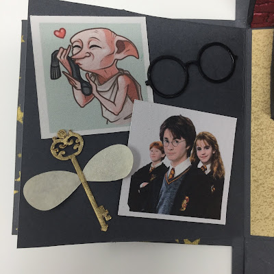
The flap to the left of the train includes a few printed pictures including Harry, Ron & Hermione as well as a cute illustration of Dobby. The flying key is from Miss Mandee and can be found here. I did alter the wings to be solid as this cut is very small and I didn't want to tear the wings trying to achieve lacy detail. I added some Perfect Pearls powder to the wings to add some shimmer. The eyeglasses I just created using a few circles.


I used a Tim Holtz Sizzix die called Santa's Helper to create the little stack of books, but this could easily be done by hand if you don't have the dies. The svg of Hedwig is another freebie from Miss Mandee and can be located here.  The wand was made by running a bead of hot glue around a toothpick and then painting it. The stars are a from a Tim Holtz Sizzix die called Swirling Stars. I also applied some glittery Stickles around the stars to up the magical feeling!


The envelope is one I found online as a free svg, although I don't recall where I found it. I sized it down to fit the flap and added the desired message for the recipient. I think that pretty much covers everything inside and out. 


I did add some extra pieces because I was having fun. I created this Snitch ornament using a glitter foam ball and gold wings cut out using some gold mirror cardstock and a Tim Holtz 3D Impresslit called Winged. 


I salvaged the hearts that I cut out of the inner box flaps and re-purposed them into a couple of ornaments as well. 


Last but not least I included a Howler card which I found on Miss Mandee's site. It was super easy to put together and so cute! 


Merry Christmas Muggles!!! 

Saturday, March 9, 2019

Here Comes Peter Cottontail


Hi there!  Just a quick post to show the fun Easter project I recently made.  This amazing SVG file is called Waiting For Easter. I purchased it from the Creatieve Papier Uitspattingen website. It includes the bunny with top hat as well as the log bench. All of the SVG pieces were cut out with my Cricut Maker.

I decided to dress Mr. Cottontail in some lovely pastel colors for Spring. I didn't think to take a lot of pictures while creating, but I'll give you what details I can.

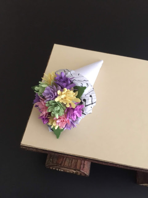
The roses on his hat and lapel are from the Tiny Tattered Floral die by Tim Holtz.  I also used this die set to create the flowers for the bouquet on the bench. 

I used some pastel paper scraps to cut out the flowers, rolled them up and glued them to the top half of a 1-inch Styrofoam ball. Then I created a small paper cone and tucked some Tim Holtz collage paper around the edge to look like the pretty papers that often accompany a fresh flower bouquet.  I simply hot glued the flower ball into the cone to complete the bouquet.  I like to think that Mr. Cottontail is waiting for Ms. Bunny to arrive so he can present her with these lovely flowers on their way to Easter Brunch!


I wanted to give the log bench a realistic appearance, so I cut the outer panel pieces from Tim Holtz Distress Mixed Media Heavystock paper. I embossed the panels with the Tim Holtz Lumber 3D embossing folder to get the realistic log texture and then I colored the panels with Tim Holtz Distress Stain in Vintage Photo and Bundled Sage. 


After the stain dried, I used a blending tool to lightly ink over the top grain with some Vintage Photo Distress Ink. Obviously I have a slight obsession with all things Tim Holtz! I applied the panels to the assembled bench after slightly curving the pieces so they would glue down nicely.


I used another Tim Holtz embossing folder called Tree Rings to emboss the end pieces of the logs and again lightly inked over them with Vintage Photo Distress Ink.  I used the exact same methods for the larger log and assembled my bench with some hot glue.


I'm really so thrilled with how the bench turned out!  

For the final detail, I added a white pom pom tail to the back of Mr. Cottontail with some hot glue. It seemed like the perfect finishing touch. 


With Easter being so late this year, I find myself happy to have completed this project early so that I can enjoy looking at it for a while.  I really hopped right on it this year!  Pun intended.

Here's one last look at the whole project:


Thanks for stopping by! 


Thursday, August 2, 2018

Halloween Countdown Calendar


Let me start by saying that this was a very difficult project to photograph - it's just shy of two feet tall! When I put all of the lights on inside of it, it gets very bright in here too. I've tried to take some pictures of each section to show you a little of what I did, but it's definitely not a full blown tutorial. 

This Halloween Countdown Calendar was my entry into Dreaming Tree's Summer Challenge. If you follow the link, you can see lots of amazing examples of beautiful 3-D papercrafting.  The challenge was to combine files from two or more Dreaming Tree projects to make a unique, custom project.

Here's a picture of the whole thing, all lit up:


I used elements from seven different Dreaming Bundles to create this colorfully spooky countdown. Working from the top down, I used the bat from the top of the Vintage Halloween Screen in  Lily's Halloween Decor bundle as the crowning element to an upside down Tick Tock Clock from the Making Time bundle.  


I used a Cricut spiderweb for the face of the calendar as I needed a web with 12 points on it since I was adding all 12 months.  The months were cutout in vinyl using a free font called Burton's Nightmare from dafont.com.  The 31 is from the same font.  The rosette in the center of the spiderweb came from the Compass Gift Box in the Good For Guys bundle.

The clockhand is from the Tim Holtz Idea-ology line - I coated it with orange Stickles to give it that wonderfully sparkly finish.  The skull and crossbones pieces are also by Tim Holtz.


The center section was actually really fun to create, but the photos didn't do a great job of showing it.  There's a new Heidi Swapp product available at select Joann's stores which is called Neon Glow. It's an 8 foot coil of battery-operated, vibrant neon wire. I used the lemon lime color to make a neon frame for my glittery ghost.  Here's what the neon looks like when you turn it on. There are two blink settings too!  


I took a video clip of the neon while I was building the project because it was so much fun to play with: 


Here's another picture of my ghostly ghoul while I was working on the middle section. The ghost is from the Shudder Shutter card from the Holiday Hauntings bundle and I have him suspended in an elongated Halloween Cookie Box which was a freebie from Dreaming Tree.  I modified the cookie box to get it to fit into the project. The idea was to make it look sort of like a pendulum in a grandfather clock.  


The bottom section is the same Tick Tock Clock as used in the top section, only this time it's right side up.  I used the frame from the front of the Lucky 7's Slot Machine in the Vegas Road Trip bundle to create the countdown window.

The word Halloween came from the Candy Dish in the Frank and Friends bundle and the 'Days To' is the Burton's Nightmare font again.  The mirrored stars from Tim Holtz were tinted with bright green alcohol ink and added to the front for some extra sparkle and interest.  

I think that about covers it from top to bottom. I've included a few more extra photos below. I really enjoyed challenging myself to create this crazy project and now I have a fun Halloween decorative piece I can use for years to come.  


We're 91 days from Halloween as of today, so there's plenty of time to create some more spooky projects.  Thanks for stopping by!

Friday, June 1, 2018

Light 'em up!


When I first saw this FREE Lighthouse Scene Card file from Bird's SVGs I was already in love with it. Such a nice clean design and I really like lighthouses. In fact, here are a few I cross-stitched back in the day before e-cutters and paper crafting took over my creative life! 


And now that I'm looking at those old projects, I think I want to create a new mat for the picture on the left - it needs some stamping or patterned paper I think. Adding that to my to do list!

Anyway, I couldn't resist the urge to make Bird's lighthouse really shine.  Last year I had some birthday money burning a hole in my pocket, so I treated myself to a Chibitronics starter kit and started teaching myself how to build light circuits into my paper projects.  The book that comes with the starter kit is great at teaching you the basics, and I've learned a lot more by reading posts and watching the accompanying videos on the Chibitronics blog.

I'm still very much learning as I go along, but am happy to share what I did to make this particular card. I made some minor errors along the way, but I'll tell you when NOT to do what I did!


I cut out all of the pieces in Bird's file, but also added two extra solid squares of the lightest cardstock using the same height and width dimensions as the top two darker layers. I used these to build my light circuit.

First, I traced around the main window area of the lighthouse so that I knew where to add a cutout for the light to shine through. Had I thought this through in advance, I probably could have done this on my Cricut, but in this case I just traced it and cut it out with a knife. It doesn't have to be perfect, nobody will see it. I'm going to call this WINDOW LAYER.


Next, I used the other extra square that I cut out to once again trace just the center of the window area to find the center point where I will stick my light down. You can see other tracing of the lighthouse and landscape shapes, but you can just ignore those. I changed my mind about the switch type I was going to use mid-project, and those markings became unnecessary. I'm calling this one the CIRCUIT LAYER.


Next, I added a double layer of vellum to the BACK of the darkest blue, top lighthouse layer window area. Again, I probably could have made Cricut cut this out for me, but it was easy enough to do by hand with some vellum scraps. And here's another thing to ignore - the strips of light blue paper backing the lighthouse's smaller windows are NOT necessary! I was making it up as I went along and just made extra work for myself. Go me!

  
Now comes the fun part - building the circuit!  I'm not going to go into too much detail as you will learn how to do this in the chibitronics starter book, but I appreciate being able to see how others create their circuits and learn from it. So here it is. It's not pretty, but nobody is going to see it, so don't worry about that. I wish I had taken more pictures as I went, but I always get so caught up in lighting the light that I forgot. 

First I draw out the circuit on the CIRCUIT LAYER square that we marked earlier with the window center point. That little triangle sticker is the chibitronic light sticker and the yellow spot in the center of the sticker is the LED bulb.  That's the part that you will want centered in the lighthouse window. I draw a small triangle there to mark where the sticker will go.


The next thing I did was decide where I was going to put my battery. I'm using a push button switch for this card, so you need to place the battery where you will want to have a push spot on the front of the card.  You can trace around the battery or just draw a circle where it will go.

The battery will be housed in a little folder of sorts that helps complete the circuit.  I used a scrap of cardstock large enough to fold around the battery and glued one side of it down where I wanted to battery to be.  Next I added the copper tape.


I'm going to save myself a lot of writing here and just share a link to a video by Jennifer McGuire where she demonstrates building a chibitronics circuit. It's so much easier than trying to write it out in a way that makes sense. 

I used some score tape inside the folder to stick the battery down. Glue works just fine too, but takes longer to dry.  Remember to make sure that you have the positive and negative sides facing the way you want before you stick it!


In the picture above you can ignore the extra little cross piece of copper tape on the left side of the folder. I had a small piece leftover and stuck it there for extra contact and to remind me that it was the positive side. It's not necessary at all.  

Finally, you are going to take your chibi light sticker and stick it down OVER the copper tape. I've seen some of the chibitronics design team folks use extra little pieces of copper tape over the top of the light sticker for extra strong contact in the circuit and have done the same here. 

Now you can press down on the battery folder to see if your LED lights up - it should!


Next I added a bunch of foam tape around the sides and battery area. The battery area should have an extra layer of foam tape so that you have to push down on the folder flap to make the circuit light up. Otherwise, if the copper tape was making constant contact, the light would just stay lit until the battery died. Again, Jennifer does a great job of showing you exactly what to do in her video.

Here's my CIRCUIT LAYER before I added the top layers to it:


I neglected to take photos of the next steps (because I was busy amusing myself with the light), but just follow Bird's directions for adding the darkest top layer of the card to the middle layer and then you can glue those two on top of the WINDOW LAYER created earlier.  Once that's done, you can just peel off the backing of the foam tape on your circuit layer and attach the front layers to your circuit layer.  I generally only take the backing off of the tape around the perimeter of the card. On the inside, it doesn't matter if it's sticky or not, it's really just there for support.

Once all of the layers are stuck together, you can glue that onto the front of the card.  Jennifer mentions that she makes a note inside the card to let the recipient know about the light feature, but there are other ways.  I found this fun stamp/die set from Lawn Fawn which is perfect for making interactive cards.  I used it to make a 'push here' button which I adhered over the battery location on the front of the card.


Now just try to keep yourself from playing with the button!


I'm sure I've managed to make this seem much more complicated than it actually is. Watch Jennifer's video. Check out the Chibitronics blog. Let your imagination go wild and let's light all the things!!

Monday, May 14, 2018

Secret Garden


When I learned that a family member was going to be celebrating her 75th birthday, I set out to build her a special card to commemorate the occasion.  The card turned into an explosion box featuring her love of gardening, tea and all things vintage!  Her garden is so beautiful that it was featured in a magazine years ago.

I used a variety of svg files, dies and punches to create my project.  I started by using the Easter Explosion Box from Dreaming Tree as the base.  I only used the main body and lid along with the panels to go on them.  I cut the panels from glittery hydrangea paper from K & Company which I've had in my stash for many, many years. The garden is bordered by huge hydrangea bushes and so I wanted to include some in the project.  The tag is cut from a Tim Holtz die and the butterfly is from a layered punch by Martha Stewart.  I embellished the butterfly with some Liquid Pearls by Ranger.


I also wanted to include a dramatic flower on top of the box instead of using a bow.  I've been wanting to make the peony from Dreaming Tree's Love You Mom collection, so I Googled it to make sure that blue peonies actually exist and they do - they're quite beautiful!


Next came the inside where I went with a completely different color scheme than on the outside.  Here's a bird's eye view with the lid removed:


The centerpiece for inside the box is this rose-filled teacup; the svg files for the cup, saucer and spoon are from the SVGCuts Tea For You & Me kit.


I cut the small rolled roses out of three different shades of pink cardstock using a Sizzix die. I added a floral foam block inside the teacup, glued some Spanish moss over top of it and then hot glued the roses on top of that. I added the tea tag which I created from a scrap of Tim Holtz paper and some numeric rubber stamps.


The doily underneath the tea cup is a Tim Holtz die. I added an extra rose and a little greenery leftover from another project, also from a Tim die.  It's hard to see in the picture, but I wrapped a thin gold washi tape around the base of the tea cup to match the gold handle and gold foil in the paper print on the outside of the cup. I embossed the very end of the spoon and added a little pearl to embellish.


I originally wanted to make some offset flaps on the corners so that it looked sort of like a lacy napkin underneath the tea cup. I converted these beautiful lace banner pennants from Bird's SVGs Tea Party collection by adding a tab to the top of the banner for gluing into the box.  Unfortunately I didn't take the width of the saucer into consideration when designing the project and when I tried to add the flaps at the corners, the wouldn't fold up properly.  I didn't want to waste them, so I just used them in alignment with the outer flaps, although I would have made them larger if that was my original plan.


I embellished each flap with a pearl and a piece of Tim Holtz ephemera that matched the project.


For the outer flaps, I used a pink and purple, lightly glittered piece of K & Company paper for the panels and edged each panel with a strip of lace cut with a Tim Holtz die.  I added some white liquid pearls along the edges as well.


On each outer panel I added more ephemera, mostly from Tim Holtz, as well as some Chit Chat stickers, also from Tim.  


On the last panel, I cut out a little envelope and tucked in a tiny card that I stamped with a Happy Birthday sentiment, added a ribbon pull tag, signed the back and added a little velcro dot to close.


Oh, and I forgot to mention the butterflies on the inside!  They are all from Martha Stewart punches. The larger ones were glued to some acetate strips which I glued to the base, so when the box explodes open, the butterflies flutter around a bit.  I cut the base layer of the butterfly with leftover patterned paper and the top layer was cut using vellum.  I added some liquid pearls to these too.  


I packed this up and put it in the mail last week. The recipient absolutely loved it! I'm so glad because it was quite a bit of work, although I enjoyed every minute of planning and executing it so it would turn out how I envisioned.  

Every project leaves me with a list of things I'd change, do better or remember to include next time. I think that's part of what makes it fun and helps us grow artistically.  I really enjoyed being able to mesh many different svgs, dies and other supplies into one cohesive project.

Well that was a long post, so thanks for hanging in there if you've made it this far. I appreciate you taking the time. Thanks so much for stopping by!  Until next time...