Tuesday, January 31, 2017

Magnolia Manor - Key West style


Since I live in a warm, sunny climate, I'm always looking to make projects that reflect local areas. In Florida, many homes are painted in colors you might not find elsewhere around the country. Whether bright or pastel, there's no shortage of pink, minty green, yellow and blue in the local neighborhoods. 

I've never had the chance to visit Key West, but have seen some photos of brightly colored Victorian homes, so I'm going to imagine that my Magnolia Manor is sitting right in the heart of Key West. Magnolia Manor is the most recent offering from SVGCuts.

This was definitely one of the most challenging projects I've attempted to date, and it didn't necessarily come out as perfectly as I would have liked. That said, it's just paper and it was fun to play with, so I'm taking the advice of Tim Holtz who encourages us all to embrace imperfection!  And if you only look at it from certain angles, you don't even see my goof ups. 
😀


If you've ever read the poem "There was a Crooked Man" I'll just say that this might be where he lives! I really am good with it though. We get a lot of hurricanes here...

I used a mesh embossing folder from Tim Holtz (shown below) to create the roof panels, but I flipped it over backwards to get the scalloped roof tile look rather than embossed mesh.  


I used some shiny gold paper to add brass kick plates to the front door along with some tiny brass doorknobs. 

All in all, I had a lot of fun inking and planning out the colors and details for this project and am already pondering what I'll add to it before next Christmas rolls around. Maybe some palm trees with ornaments!

As always, thanks so much for stopping by to check out my Key West Magnolia Manor!  I always love to hear what you think. 

Tuesday, January 17, 2017

Love Bug Box


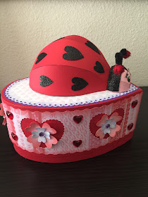
From the moment I saw the 'coming soon' post on Instagram for this ladybug box, I was in love! Ladybugs hold a special place in my heart and as a result, I have a small but unique collection of ladybug treasures that I've accumulated over the past 25 years. Because of this, I was understandably excited to see two of my favorite things, ladybugs and paper, come together in this adorable 3D box from Dreaming Tree's Love You More bundle.


I have no intention of using this box as a mailbox or bank, so I hid the contours for the mail slot when I was laying this out in Cricut Design Space prior to cutting. You can see above that I added some hearts to the back center panel of the ladybug's body where the slot would have been. I also changed the direction in which the hearts point.


This side view shows how I redistributed the hearts on the ladybug body as well as some of the flower embellishments. 

I cut  the larger flower out of light pink glitter paper and inked the edges with some abandoned coral Distress ink. The smaller flowers were cut from the same pearl paper I used on the top of the box which is pearl heart print which I also inked with Distress, this time in shaded lilac.  


I liked how the purple gems in the original project tied the colors all together, but I didn't have any purple gems. Alcohol ink to the rescue! I simply dabbed some Purple Twilight alcohol ink from Ranger onto some clear gems and behold...purple gems! I use this little trick a lot to create gems, pearls and other embellishments that match my project color scheme.


The pipe cleaners I have are so thick and fuzzy that when I tried to loop them, they looked large and rather silly, so I kept them short and hot glued some glittery red pom poms to the ends.  


I love how this project came together and am so thrilled to finally have a 3D paper ladybug! I think I'll be making more of these in the future.  

Thanks for stopping by!  

Saturday, January 14, 2017

Lever Love


With Valentine's Day just a month away, I decided to make this Celtic Heart Lever Card from Bird's SVGs Celtic Charm Collection.

Celtic Charm SVG Collection from Bird's SVGs

Lever cards are so cool because of the lever action of the main focal point when the card is opened and closed. What a fun surprise for the recipient!


Because I fell in love with this shabby floral print paper, I picked a less conventional brown and pink color scheme for this card as it seemed to go together really well. I added some very tiny gems here and there on the floral print just to add a little bit of sparkle. 

On the inside, I did some stenciling on the three hearts using distress ink and the Tim Holtz layering stencil called Doily. I think the vintage lace pattern matches the shabby look of the patterned paper.


The sentiment panel in the middle (where you see the empty brown spot) is just waiting for me to decide what I want to write and/or stamp in there. 

I frequently leave the sentiment panels unattached until I'm sure of who the card is going to and what I want to say. That way, if I want to use a rubber stamp or add some inking, it's not too late because it's already been glued down. And let's face it, sometimes a stamped image doesn't turn out as you'd hoped. I like the option to be able to flip it over and use the other side rather than having to cut a new piece to glue over the first one in order to hide the mistake. Can you guess this may have happened to me a time or two? 

For another fun Valentine's Day card, you can find my post about this pretty rose card that was made from Bird's Roses are Pink collection last year. 


And, in addition to these lovely collections, Bird has section of completely free Valentine's projects which can be found here.  

As always, thanks for stopping by! I'd love to hear what you think about these projects.